iVisa is a company that acts as a 3rd party, helping to streamline the visa application process for users traveling internationally.
Problem
Of the orders that got sent back to the customer for more information (MINs), 80-85% of these stemmed from document upload errors. These were vital to avoiding errors and delaying delivery.
How might we reduce the MIN rate while not increasing time on task too significantly?
The Goals
1) Understand why users were having trouble uploading documents
2) Restructure/improve help content
3) Test new content with users
Solution
Rather than having the help panel off to the side as a tertiary focal point, we brought it front and center and had the users click through the upload process one screen at a time, rather than as a "choose your own adventure" multiple-option screen.
We knew that MINs were a problem, and that the largest source of MINs was because of the document upload flow. But we didn't know why it was a problem. For that, we had to talk to customers.
Usability Testing the Current State
Since this flow took place beyond the payment wall and involved users' sensitive information, we did not have good data. To fill in the gaps, we conducted moderated usability testing with users in a playground environment.
Our single biggest takeaway was that users did not read the instructions either because they felt that they knew how to upload a file, or because they just missed it. This led to photos being rejected.

Users either did not notice the help panel on the right or didn't think it was information they needed.
Planning the Larger Project
Now that we knew the why, we had to plan out the larger project. We created a research plan and organized into a design squad to tackle the project, beginning with a kickoff workshop where we could share our usability testing findings with the larger team.

Our design team consisted of a UX researcher, two designers, two product managers, a dev advisor, and a UX writer.
Expert Review of the Current State
In addition to our usability testing, we also worked together with our product managers to see where our current designs were lacking and what could be improved. We went screen by screen and annotated each suggestion that we had.
How Were Competitors Handling the Same Problem?
Although we didn't have many competitors in the space, we did take a look at their solutions. We kept coming to the same conclusion: everyone tried to draw as much attention to the instructions as possible.
We worked with the designers to ideate different approaches to solving our main problem.
Prototyping Three Different Solutions
Utilizing everything we learned so far, we came up with three new variations.

This version added significant clicks to the flow.
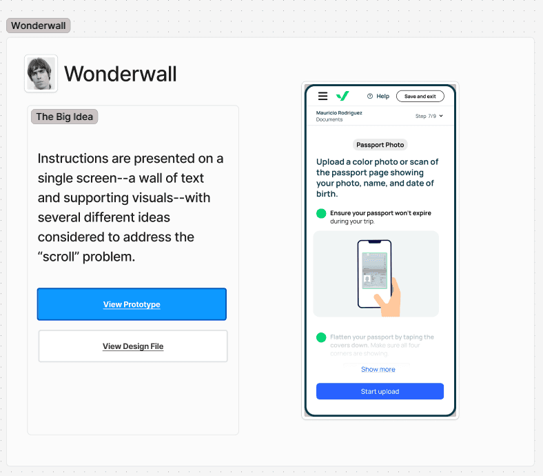
This version introduced a lengthy scroll.
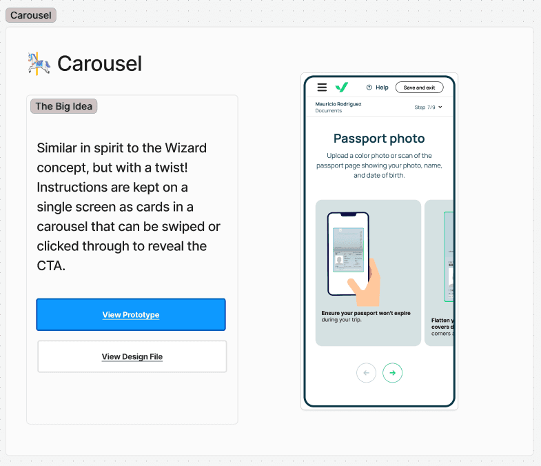
This version presented the instructions horizontally
As a team, we went through each version and discussed the pros and cons, voting on our favorites. We ended up selecting a modified version of the "Wonderwall", reducing imagery in order to reduce the scroll.
Because this was a high priority project with a tight timeline, we chose to not test each prototype and only tested the winner of our prototype review.
Moderated Usability Testing of the New Prototype
We tested our prototype with 10 users — five on mobile and five on desktop. Our traffic was split almost down the middle with respect to device, so it was important to test each cohort.
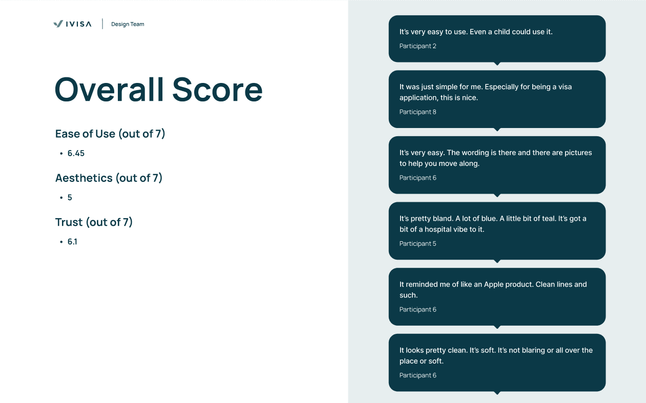
The prototype scored very well in ease of use and trustworthiness, though aesthetics could be improved
Users responded very well to our new version of the document upload. Users had very little trouble understanding how to navigate the flow, despite there being 3 different document types that not everyone would run into during a normal interaction with the product.
Preference Testing the Text
In order to draw even more attention to instructions that would result in automatic failure if not adhered to, we went to Maze to gather some additional data via preference testing.
Because the organization decided at the outset that we were going to build something regardless, our developers worked on creating the basic structure of our prototype on our test server before we concluded our usability testing.
Only Minor Changes Needed
Overall, our prototype only received minor negative feedback — mostly in the way of updating some copy or removing some confusing elements. The test was a success.

Our new upload flow isolated the instructions in the center panel for users to read through.
Metrics Improved
We reduced our MIN rate by 50% with the new designs while time on task was largely unaffected. Users were able to read the instructions and absorb them while not getting slowed down too much with extra clicks.
Next Steps
While a success, we did have a few ideas that didn't make it into the full redesign. We created a future roadmap for these ideas, as well as listing our acceptance criteria for nuanced document types.